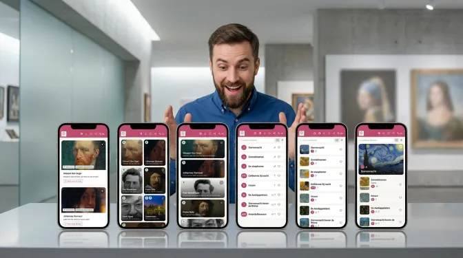
Every museum is different. One has two tours, another has twelve. One revolves around a single masterpiece, another around a hundred objects in display cases. Yet most museum apps look the same for everyone. That is why infotainment.guide lets you choose your own museum app layout. You pick from three options for the overview of your tours and three for the list of stops. That makes nine combinations, without a single line of code. In this article, you'll read how it works, what each option does and which museum it suits best. You'll also see how the right choice helps you build an accessible audio tour.
Why your museum app layout matters
The first seconds in an app count. For example, visitors stand in the hall, pick a language and then want to know what there is to do. If they see an overview that fits your museum, they set off. If they have to search, the phone goes back into their pocket.
Moreover, a screen tells visitors something about your museum. An art museum with strong photos wants to show them large. A city with ten walking routes wants lots of choice on one screen. A long tour with forty stops, on the other hand, needs a calm list with clear numbers. One fixed museum app layout cannot do all of that. Therefore, infotainment.guide gives you the choice.
Two screens, three options for each
You choose the museum app layout for two screens. The first is the tours overview: the screen visitors see as soon as they have picked a language. The second is the list of stops inside a tour. There, visitors switch between a list and tiles themselves. You change the list, while the tiles stay the same.
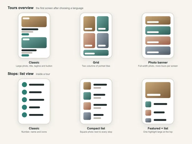
Three options for two screens: that much freedom in a museum app layout is unique. Your choice applies to the whole museum and to every language. So you don't set anything per tour or per language.
The tours overview: Classic, Grid or Photo banner
For the first screen, there are three options:
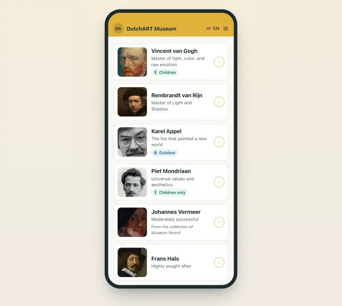
- Classic is the original view. Each tour has a large photo with labels for the language, an outdoor tour and children. Below it are the title, a short tagline and a button to start.
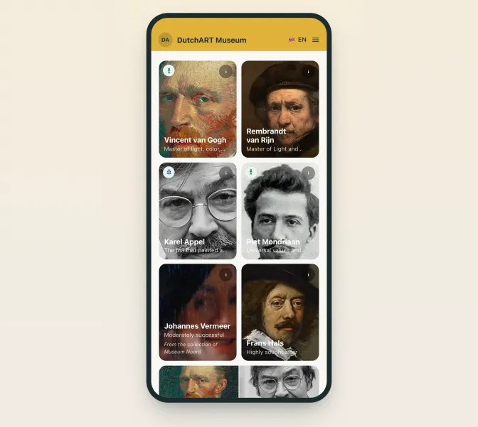
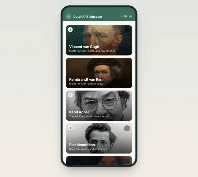
- Grid places the tours in two columns of portrait tiles. The title sits on the photo. If you have an odd number of tours, the app makes the last tile wide. That way, the grid always ends neatly.
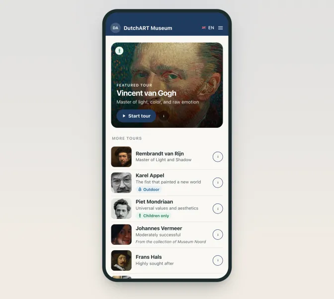
- Photo banner shows each tour as a wide photo with the title on it. The banner is lower than in Classic, so more tours fit on one screen.
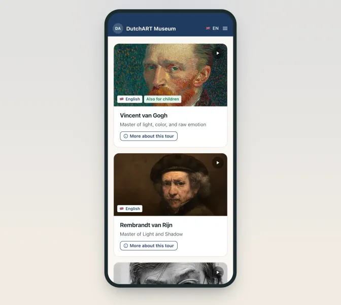
In Grid and Photo banner, the outdoor and children labels appear as a small icon. When visitors save stops as favourites, a favourites card joins the overview. That card shows up to eight photos as a mosaic, in every option.
Which museum app layout suits your tours?
The best museum app layout mainly depends on the number of tours and the strength of your photos. Do you have one to three tours? Then choose Classic. After all, each tour gets room for a photo, a tagline and a clear start button. That tagline, in particular, convinces a hesitant visitor. In addition, the text sits below the photo instead of on it, so it stays easy to read and accessible.
Do you work with strong images, as in an art museum, a photography museum or a design collection? Then Grid lets your photos speak. Families and young visitors often choose by image, and two columns show a lot at a glance.
Do you have many tours, for example city walks, a castle with gardens or a steady flow of new exhibitions? Then choose Photo banner. As a result, visitors scroll less and still see every photo across the full width.
The stops in a tour: Classic, Compact list or Featured + list
Inside a tour, visitors see all stops. The museum app layout also offers three options for that list:
- Classic shows the number, the name and icons for each stop, for example audio or video. This is the original list.
- Compact list puts a square photo on the left with the name, number and icons on the right.
- Featured + list shows one stop large at the top. All stops then follow as a compact list.
You decide yourself which stop goes on top, while the app does the rest. In backstage, tick the featured box under Basics on the stop itself. Each tour can have one featured stop. If you pick none, the first stop appears large at the top. Is your featured stop not the first on the route? Then visitors see it at the top and in its own place. That way, the order of the route always stays intact.
Who benefits most from each list of stops?
Classic suits long tours. Visitors look for the number on the sign next to an object and find the stop straight away. Even with forty stops, the list stays accessible and quick to scan.
Compact list works well when people recognise an object by its image. Think of paintings, cars, animals or a display case full of finds. Visitors see the photo and therefore know at once where to go.
Featured + list is made for your masterpiece. Do you have a famous painting, a new acquisition or a sponsor's piece? Then put it large at the top, so nobody misses it. Do you even want to share part of your collection with other museums? Then read how that works in sharing collections with the museum app.
An accessible audio tour starts with a calm screen
Not every visitor is handy with a smartphone. Think of older visitors, people with poor eyesight or someone using the app for the first time. For them, an accessible screen makes the difference between listening and giving up. An accessible audio tour therefore needs little clutter and a clear structure.
The Classic options therefore make your tour more accessible. In the tours overview, the title sits below the photo with plenty of contrast. Similarly, the list of stops only shows a number, a name and a few icons. In short, there is little to trip over. Combine that with short stories, because length also makes a tour accessible. For more on this, read the ideal length of audio stories. Do you welcome many young visitors? Then a visual layout often works better, just like the children's versions in the interactive museum app for young and old.
How to change your museum app layout in backstage
Changing your museum app layout takes a few minutes. You do it in backstage, where you manage the app:
- Open Tours and click App layout.
- Under Tours overview, pick an option. On the right, you immediately see a preview with your own tours.
- Under Stops: list view, pick an option for the list. If you have several tours, you choose which tour the preview uses.
- Happy with it? Click Save. Only then do visitors see the new design.
The preview shows your tours as an adult visitor sees them. As long as you don't save, nothing changes in the app. A notice at the top reminds you of changes you haven't saved yet. Only your museum's administrators can make the choice.
Live at once, without an app store update
infotainment.guide is a web app. Visitors scan a QR code and the tour opens in the browser, without a download. That also makes the tour accessible, because nobody has to install an app first. As a result, everyone sees your new choice as soon as you save. No new version in an app store is needed. Why we chose a web app is explained in tourist apps: a PWA or a dedicated app.
That makes experimenting easy. Switch to Photo banner in summer for the outdoor routes and go back to Classic in winter. Or keep a masterpiece large at the top for a month. You can switch as often as you like.
See the museum app layout in the demo
Would you like to see how it works in practice? Open the DutchART demo museum on your phone. Its museum app layout currently uses Grid for the tours and Featured + list for the stops. On the museum app page, you can read what else infotainment.guide can do. Or discover how to create an audio tour yourself. Do you have questions about the best layout for your collection? and we'll gladly think along with you.
Updated on
Stay up to date
Every now and then, the news from GuideXpresse in a single email: museum guides, tour guide systems, software, service and voice-overs. Short and no more often than needed.

 References